Typography Rendering Quality in Text-to-Image Models
Why AI struggles to render legible text inside generated images.
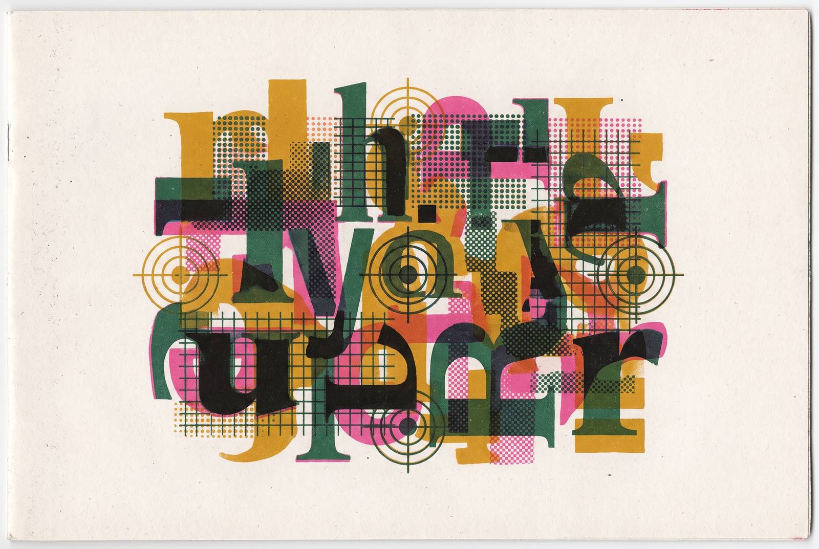
Typography garbling in AI-generated images is not a prompting problem that better syntax will solve. It is a structural consequence of how the text encoders inside these models are built, and the failure mode is visible in every major system on the market. Text encoders such as CLIP and T5 process language semantically. They understand what words mean as concepts, not what individual glyphs look like as visual shapes. The model has no glyph-level representation to draw on, so it reconstructs letterforms from learned statistical patterns rather than from any explicit understanding of what those shapes are.
This failure compounds when a prompt describes overlapping or spatially distinct text regions. Flat global conditioning keeps the encoder from giving a headline, a subheading, and a label different typographic handling in the same image. The outcome is the familiar garble: letters that start correctly and dissolve into pseudo-glyphs, words that render twice, scripts that blend into each other.
For non-Latin scripts the problem deepens. Stroke omissions or glyph distortions that a native reader catches immediately are invisible to the encoder, because it has no representation of individual strokes at all. A Chinese character with one missing radical is semantically meaningless to a native reader, but to the model it is statistically close enough to pass. The error lands in the gap between what the encoder knows and what the script demands.
What "legible text in images" actually requires, and why it was unsolvable until recently
Rendering legible, typo-free text inside a generated image is a qualitatively different task from generating a photorealistic scene. The field treated it as a secondary problem for years, partly because image quality benchmarks rewarded photorealism and composition, not orthographic accuracy, and partly because the encoder architectures that made text-to-image generation possible at all were fundamentally unsuited to the task. The evidence for this is empirical. Testing across four models on the Ropewalk platform in June 2026 found that text rendering broke down most often on long strings above six words and on tightly curved baselines, and held up best on short, high-contrast display type. A model that can render a convincing face at high resolution will still mangle a seven-word sentence on a billboard, because the failure is not in the image synthesis pathway but in the text representation that conditions it.
What changed recently is that a small number of model families began treating typography as a first-class design target. They built dedicated typography systems, agentic reasoning passes that check output against intent, and vector-native outputs that preserve glyph structure as editable paths. These are architectural responses, not prompt-engineering tricks. The models that still treat legible text as a side effect continue to fail in predictable, structurally determined ways, regardless of how carefully the prompt is written.
This distinction matters because it resets what counts as a solved sub-problem. A model that renders five words of Latin display type reliably has not solved typography. It has solved a narrow slice of the task, and the boundaries of that slice are defined by the architecture of the encoder, not by the skill of the person writing the prompt.
How each current model breaks down by job type, not by overall rank
The useful way to evaluate current models is not to rank them globally but to map each one's architectural strengths and failure modes to specific jobs. Each model in the typography-capable set occupies a distinct position, and the differences between them are structural. Ideogram, in its v3 Quality and 3.0 configurations, is a headline and logotype machine. Ideogram 3.0 on Infer is priced at $0.06 per image, the highest per-image price among typography-specialist models, and its positioning is built entirely around in-image copy. The cost implication is straightforward: v3 Quality is the premium tier, and teams should reserve it for hero assets rather than rapid drafts. Its script coverage is exactly where the next model category takes over.
GPT Image 2 covers the widest documented script range in published comparisons, including Japanese, Korean, Chinese, Hindi, and Bengali. It achieves this through an agentic reasoning pass that researches, plans the composition, renders, and checks its own output. The strongest case for it is localized campaign art, one design rendered in five languages with correct scripts in each, where no other documented model matches it.
Recraft V4 Pro, on the Ropewalk platform since 2026-02-19, is the design-system specialist, generating print-ready artwork at roughly 2048px. Recraft V4.1, released May 14, 2026, specifically tightened vector and typography precision. For brand assets where the typography is the product, and where a designer will touch the output afterward, this editability matters as much as raw accuracy.
Imagen 4 Ultra, released 2026-04-20, wins when text must live inside a physically convincing world. Signage, storefronts, product packaging, billboards: these are the jobs where its high-resolution rendering and 3D-integrated text are strongest. In June 2026 testing it produced the most convincing physically integrated text of the group, but that strength is specific to display-scale text in scenes, not to paragraphs of body copy.
The budget and multilingual options fill narrower niches. Nano Banana 2 renders thirty-plus languages including non-Latin scripts at roughly 1.4 seconds median latency and $0.039 per image. Midjourney sits outside the typography set entirely: using it for in-image text is a workflow error, not a prompting challenge, because the architecture does not prioritize glyph accuracy.
Why body copy, long strings, and diacritics remain unsolved across every model
The remaining typography failures are not gaps between models but gaps shared by all of them. They are boundary conditions where even the best tools consistently break, and they define the hard floor that production teams must design around. Diacritics in Polish, Turkish, Vietnamese, and other diacritic-heavy Latin scripts get dropped or duplicated even by the typography-specialist models. For Arabic, Cyrillic, and standard CJK, coverage varies sharply by model, and the failure rate is high enough to require proofing on every single output. The error rate that is tolerable in Latin scripts, where a dropped accent mark slows but does not stop a reader, is professionally disqualifying in dense-stroke scripts, where a missing radical changes the character entirely.
This means a production workflow that relies on prompt iteration to fix these failures will not converge. The failures are architectural, not stochastic noise that more attempts will average out. The only reliable response is to stop asking the model to do what its architecture cannot do, and to route the work elsewhere.
What research into typographic style transfer reveals about where the real gap is
Academic work on typography failure has focused on giving models explicit glyph-level structure, not on scaling prompt engineering. The research direction confirms that the field itself treats this as an architecture problem. Calligrapher, a framework introduced by Hong Kong University of Science and Technology and Ant Group in arXiv:2506.24123, addresses the gap directly with three architectural contributions. Its self-distillation mechanism uses a pre-trained text-to-image model alongside a large language model to automatically construct a style-centric typography benchmark, eliminating the manual annotation bottleneck that has slowed progress. And its in-context generation mechanism embeds reference images directly into the denoising process, enabling precise glyph positioning and style alignment that prompt-only approaches cannot achieve.
Calligrapher's target applications, digital art, branding, and contextual typographic design, map directly onto the professional use cases where current models fail most visibly. The research direction confirms that style-consistent typography at production quality requires reference-image injection and glyph-level control, not better prompt syntax. Teams need to build that control into their workflows now, rather than waiting for base models to close a gap that the field itself is only beginning to address at the architectural level.
Why brand typography specifically breaks when AI enters the production pipeline
The architectural gap in text rendering is most damaging in brand contexts, because brand typography is the one place where style consistency is non-negotiable and errors are immediately visible to the audience. A garbled word in a casual social image is an annoyance. A garbled word in a brand asset is a governance failure.
Commercial production requirements are rigid. Output must adhere to exact typographic specifications tied to brand guidelines, consistent across production batches, without the visual hallucinations that neural networks introduce. Typography is where that discrepancy is most acute, because typography is where specificity matters most and where encoders are least equipped to provide it.
The prompt-drift problem illustrates this concretely. A model that respects a specified font and color in the first generation will revert to defaults by the fifth in a batch run. Each generation is an independent roll of the dice, conditioned by a sentence rather than by a specification.
This means brand typography failures are not one-off errors to catch in review. They are a systematic property of how these models handle repeated generation without structured context. The reviewer catching the fifth-image drift is not catching a fluke. They are catching the predictable outcome of an architecture that has no memory of what it was told four generations ago.
What structured brand context for AI actually means in practice
The consistent failure of prompt-based typography control points to the same root cause as general brand consistency failures: AI tools have no persistent, structured representation of a brand to draw on, so they default to category-average output on every generation. Most brand guidelines exist as PDFs, design system pages, or Figma files written for humans who can read, interpret, and apply judgment. These are human-readable reference material, not structured signals that an AI tool can apply at the moment of creation. The emerging practitioner standard separates brand documentation into two layers: traditional brand guidelines that explain voice, values, and visual identity through narrative and annotated examples, built for human interpretation, and a structured layer that machines can consume directly.
For typographic specifications specifically, the conversion is concrete. An AI image generator needs subject description, style parameters, composition rules, exact brand palette values as hex codes, and explicit prohibitions. Structured context is not a richer version of a prompt. It is a different layer of the stack, one that persists across generations and does not drift.
How font governance and typography context can be delivered to AI tools through MCP
Structured brand context is only as useful as its delivery mechanism. A DESIGN.md file is static reference. The production problem requires context that is live, versioned, and retrieved automatically at the moment of generation.
The Model Context Protocol provides exactly this. It is a standardized interface that lets AI agents retrieve structured knowledge, including typographic specifications, from a connected source rather than relying on what is in the prompt. Updates to a brand's typographic specifications propagate to every downstream tool automatically, without manual prompt updates across every workflow and every team member.
Monotype Labs' Enterprise MCP Connector is the most direct published example of MCP applied specifically to font governance. It links compatible AI tools to a customer's Monotype Fonts library: the specific fonts in their library, the licensing behind those fonts, and their production approvals. Typography governance moves to the point where content is created, not the point where it is reviewed after the fact. The connector is built on the Model Context Protocol standard and initially supports Claude and Claude Design, with ChatGPT support planned.
Bloom operates as the same kind of brand infrastructure layer, ingesting a brand's existing assets, guidelines, design systems, fonts, files, and making them available as structured, versioned Brand Skills that any connected agent or MCP-compatible tool can retrieve. The MCP 2026-07-28 specification introduced a stateless protocol core, making agent connections more reliable and memory-efficient, plus a new extensions framework with MCP Apps and Tasks formalized as extensions under it. The protocol is maturing toward exactly the kind of persistent, reliable brand-context delivery that typography governance requires.
Building a typography workflow around what models can and cannot do today
The correct response to AI typography's architectural limits is a workflow that routes each job to the model best suited for it and uses design tools for what AI cannot yet reliably do. It is not a search for a single model that handles everything, because no such model exists. The decision logic by job type is clear. Short headline and logotype work, one to five words in Latin script, goes to Ideogram v3 Quality or Ideogram 3.0 as the first pass, with proofing before shipping and the premium tier reserved for hero assets. Multilingual or multi-script campaigns go to GPT Image 2 for the widest documented script coverage, with higher cost and slower generation accepted as structural trade-offs of the reasoning pass. Design-system assets that a designer will touch afterward go to Recraft V4 or V4 Pro for native SVG output that opens in Figma or Illustrator as editable shapes. Text physically integrated into a photorealistic scene, signage, packaging, storefronts, goes to Imagen 4 Ultra for high-resolution photorealism, with the limitation on dense paragraph text accepted. Bilingual CJK-plus-Latin on a budget goes to Seedream 4.0 for the specific dual-script case, and it is not a general-purpose default. Artistic visuals where typography will be added by a designer go to Midjourney, treated as a deliberate handoff rather than a fallback.
For anything longer than a short phrase, or involving diacritics in Polish, Turkish, Vietnamese, Arabic, or standard CJK, the correct workflow decision is to generate the image without the text and composite typography in a design tool. This is not a workaround. It is the professionally correct approach given the architectural reality, and it will remain so until text encoders acquire glyph-level representations that they do not currently have. The team-wide implication is that every agent and tool that touches a brand's visual output should share the same typographic context, not isolated, re-prompted copies that drift by the fifth generation. Brand typography at AI scale requires infrastructure, not just better prompts.